Cross-Browser Testing on macOS: The Complete Developer's Guide
Cross-browser testing is a critical part of web development, yet macOS users face unique challenges when trying to validate their websites across different browsers and devices. Unlike Windows developers who can test on native Internet Explorer and Edge instances, Mac developers must navigate a fragmented landscape where Safari dominates the platform and Chrome requires workarounds to properly test responsive designs.
In this guide, we'll explore the cross-browser testing challenges specific to macOS, evaluate different approaches available to you, and introduce you to BrowserView—a purpose-built solution that solves many of these problems.
Why Cross-Browser Testing Matters on macOS
Despite macOS being a minority platform in overall web traffic (around 15-20%), it holds significant importance for several reasons:
- Safari's Rendering Engine: WebKit (Safari's engine) renders differently from Chromium, especially regarding CSS, JavaScript performance, and WebGL
- Device Fragmentation: Users access your site from iPhones, iPads, MacBooks, and older devices—each with different capabilities
- Performance Variations: The same website can perform differently across browsers due to engine optimizations
- Feature Support: CSS Grid, Flexbox, and newer JavaScript features render inconsistently across browser versions
The fundamental problem for Mac developers is that you can't natively run a true Windows browser environment, and testing on real devices at scale becomes expensive and logistically challenging.
The macOS Cross-Browser Testing Challenge
What Makes macOS Testing Difficult?
Limited Browser Availability: On macOS, you're primarily limited to Safari and Chromium-based browsers (Chrome, Edge, Brave, etc.). You cannot run Internet Explorer or older Edge versions natively, which matters if you support legacy users.
Browser Rendering Differences: Even though Safari and Chrome may appear similar to end users, their underlying rendering engines work very differently:
- WebKit (Safari) handles CSS differently, particularly with
-webkit-prefixes and non-standard properties - Chromium (Chrome) has different JavaScript engine optimization, WebGL support, and audio/video codec handling
- Real user agents, device pixel ratios, and viewport dimensions vary across devices, but you only see them in the browser you're testing in
Device Dimension Testing: Testing an iPhone 14 Pro Max design on your Mac's full desktop screen doesn't give you an accurate representation. You need to actually see your design at the correct viewport dimensions (1170x2532 pixels, for example) with accurate device pixel ratios.
Touch Event Emulation: Hover states work fine on desktop, but touch devices don't have hover. Testing touch interactions on your Mac's mouse-driven interface is unreliable.
Performance Testing: JavaScript engine performance differences between Safari and Chrome can significantly impact user experience, especially on lower-end devices.
Evaluation of Cross-Browser Testing Approaches
Approach 1: Manual Testing with Safari + Chrome
How It Works: Open both Safari and Chrome on your Mac, visit your website, and manually test features and layouts.
Pros:
- Free (you already have both browsers)
- Real browser engines
- No setup required
- Works for basic functional testing
Cons:
- Manual and time-consuming
- Can't see actual device dimensions
- No device profiles or user agents
- Limited to your Mac's screen size
- Can't test touch interactions
- Hard to catch responsive design issues
- No way to test device-specific behaviors
Best For: Quick spot-checks or when you're already aware of specific issues to verify.
Approach 2: Browser DevTools Responsive Mode
How It Works: Use Chrome DevTools or Safari's responsive design mode to simulate different device dimensions.
Pros:
- Built-in to browsers
- Free
- Fast iteration
- Can test different viewport sizes
Cons:
- Emulated, not real device rendering
- User agents can be faked but device pixel ratios aren't fully accurate
- Touch emulation is crude
- Can't test actual device performance
- Doesn't emulate hardware acceleration differences
- Both engines still render the same (Chrome's DevTools don't magically use WebKit)
Best For: Quick responsive design checks during development, not comprehensive testing.
Approach 3: Xcode Simulator (iOS/iPadOS)
How It Works: Use Apple's built-in iOS Simulator included with Xcode to test web content on simulated iPhone and iPad environments.
Pros:
- Free with Xcode (already on your Mac)
- Tests Safari engine on actual iOS viewport sizes
- Can test with real iOS features (geolocation, camera permissions)
- Good for iOS-specific testing
Cons:
- Only tests Safari engine (no Chrome/Android)
- Simulator performance is slow (requires virtualization)
- Still an emulator, not real hardware performance
- Setup overhead (requires Xcode installation)
- Large resource consumption
- Can't test multiple devices side-by-side
- No ability to test Chromium rendering
Best For: iOS-specific testing when you already have Xcode installed.
Approach 4: Cloud-Based Services (BrowserStack, LambdaTest, Sauce Labs)
How It Works: Subscribe to a cloud service that hosts real devices or browser instances you can interact with remotely.
Pros:
- Access to real devices and browsers
- Supports Windows browsers (IE, Edge)
- Comprehensive device coverage
- Can test on Android
- Good for cross-platform testing
- Excellent for CI/CD integration
Cons:
- Monthly subscription ($50-200+)
- Requires internet connection
- Latency in interaction (not real-time responsive)
- Can be slow for iterative design testing
- Setup and learning curve
- Not ideal for quick local testing
Best For: Comprehensive testing across many devices, CI/CD pipelines, and when you need to test Windows browsers.
Approach 5: Responsively App
How It Works: Open-source desktop app that shows multiple device previews in a responsive grid layout.
Pros:
- Free and open-source
- Shows multiple devices simultaneously
- Better than browser DevTools
- No subscription required
- Decent UI for viewing layouts
Cons:
- Still uses Chrome's rendering engine only
- Can't test Safari/WebKit without switching browsers
- Still uses emulated user agents and device pixels
- No touch emulation
- Requires manual browser switching to test WebKit
- Can't compare WebKit vs Chromium side-by-side in the same interface
- Limited device profiles
Best For: Quick multi-device layout checks for Chromium browsers.
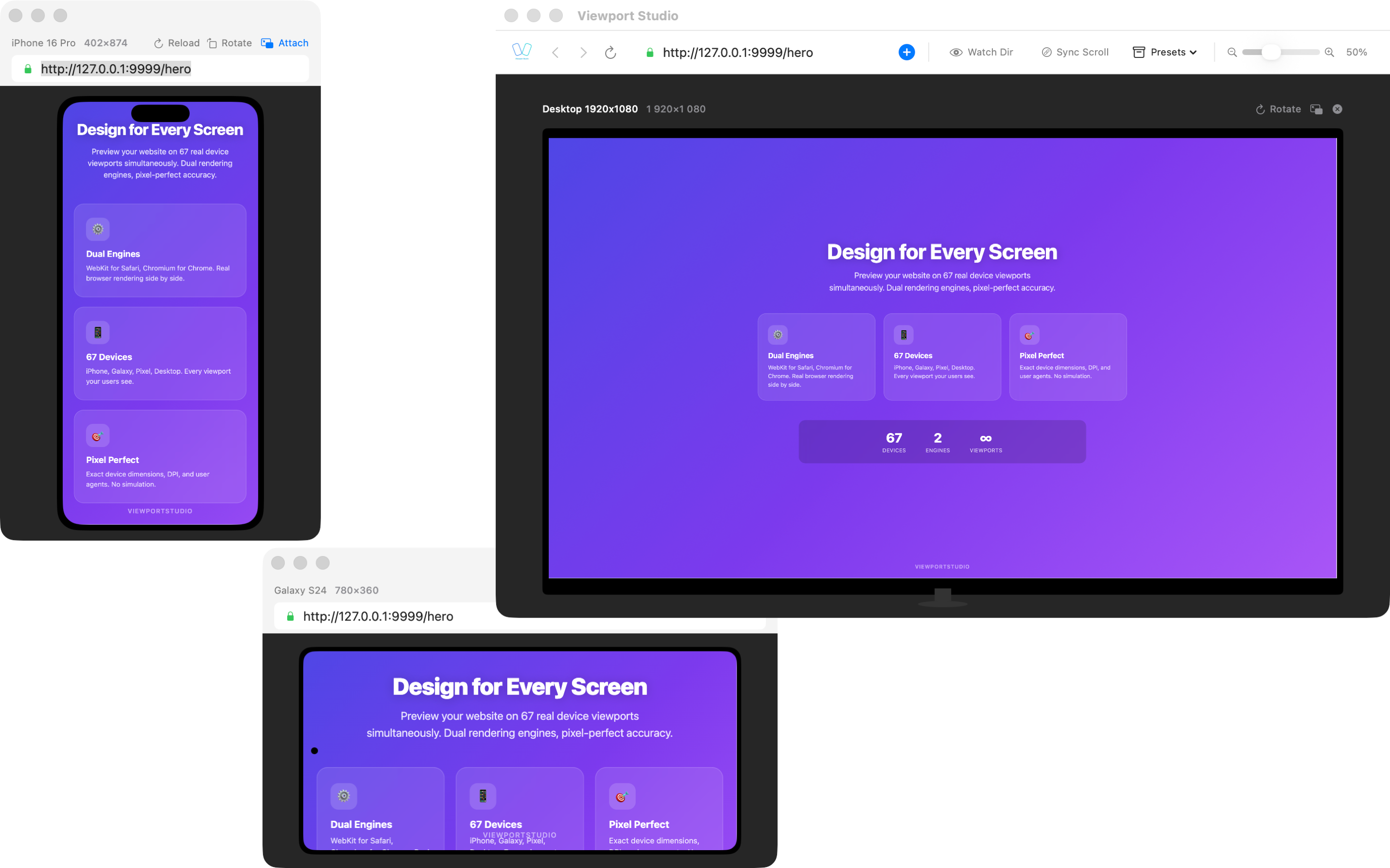
Approach 6: BrowserView – Native Side-by-Side Real Browser Engines
How It Works: BrowserView is a native macOS app that renders your website using two real browser engines simultaneously—WebKit (Safari's engine) and Chromium (Chrome's engine)—in a side-by-side interface.
Pros:
- Real WebKit + real Chromium rendering (not emulated)
- 60+ device profiles (iPhones, iPads, Pixels, Galaxy devices)
- Accurate device pixel ratios
- Real user agents
- Touch emulation with native gestures
- Side-by-side comparison of WebKit vs Chromium
- Instant local testing (no internet required)
- Fast, responsive interaction
- No cloud subscriptions needed
- High-resolution previews
- See rendering differences immediately
Cons:
- Requires purchase (subscription or one-time)
- Only tests WebKit and Chromium (won't find issues specific to other engines, but covers ~95% of market)
- Doesn't test Windows-specific browsers
- Limited to macOS
Best For: Mac-based developers who want the fastest, most accurate way to test responsive designs and catch cross-engine rendering issues locally. Perfect for iterative design work.
Comparing the Approaches: A Practical Framework
| Feature | Safari + Chrome | DevTools | Xcode Sim | BrowserStack | Responsively | BrowserView |
|---|---|---|---|---|---|---|
| Cost | Free | Free | Free | $50-200+/mo | Free | $9-20/mo |
| Real Engines | Yes | Partial | Yes (iOS) | Yes | No (Chrome) | Yes (both) |
| Side-by-Side | Manual | No | No | No | Yes | Yes |
| Device Profiles | None | Limited | Limited | Extensive | Many | 60+ |
| Touch Testing | No | Limited | Yes | Yes | No | Yes |
| Local Testing | Yes | Yes | Yes | No | Yes | Yes |
| Android Rendering | No | No | No | Yes | No | Yes (Chromium) |
| Windows Browsers | No | No | No | Yes | No | No |
| Speed | Slow | Medium | Slow | Slow | Medium | Fast |
Why BrowserView Solves the macOS Problem
If you're a macOS web developer, BrowserView addresses the core pain point: you need to see how your design renders in both WebKit and Chromium engines, on realistic device dimensions, without leaving your Mac and without expensive cloud subscriptions.
The Real Engine Advantage
BrowserView uses real, unmodified browser engines:
- WebKit: The actual engine used by Safari and all iOS browsers
- Chromium: The actual engine used by Chrome, Edge, and most other modern browsers
This is different from browser DevTools, which simulate device constraints but still use the browser's own engine. When you open DevTools in Chrome and select "iPhone 14 Pro," you're still running Chrome's Chromium engine—you're just pretending the viewport is smaller.
BrowserView actually renders with two different engines, which means you'll catch issues like:
- CSS properties that work in one engine but not the other
- JavaScript performance differences
- WebGL rendering differences
- Font rendering inconsistencies
- Layout calculation differences in edge cases
Device Profile Coverage
With 60+ built-in device profiles covering:
- iPhone 15, 14, 13, 12, 11, SE (all generations)
- iPad, iPad Air, iPad Pro (multiple sizes)
- Google Pixel 8, 7, 6 (and earlier)
- Samsung Galaxy S24, S23, S22 (and earlier)
- Plus iPad and Galaxy tablet variants
You can test every realistic device your users might use without manual configuration.
Workflow Benefits
For typical design-to-launch workflow:
- Design Phase: Open BrowserView with your local development server, see layouts instantly in 60+ device profiles
- Responsive Design Testing: Adjust CSS, refresh, see changes in real WebKit and Chromium engines immediately
- Cross-Engine Debugging: See side-by-side rendering to identify engine-specific issues
- Performance Validation: Understand how your JavaScript performs differently across engines
How to Choose the Right Approach
Use Safari + Chrome manual testing only for quick spot-checks.
Use Browser DevTools for initial layout validation during development.
Use Xcode Simulator if you specifically need iOS-only testing and already have Xcode.
Use BrowserStack/LambdaTest when you need comprehensive cross-platform testing, Windows browsers, or CI/CD integration.
Use Responsively App if you only need Chromium testing and want multiple devices in one view.
Use BrowserView as your primary local testing tool for:
- Rapid design iteration
- Catching WebKit vs Chromium differences
- Comprehensive device profile testing
- Fast, responsive workflow without cloud delays
- When you want real engines, not emulated
Best Practices for macOS Cross-Browser Testing
Test Early and Often: Don't wait until launch. Test weekly or after major changes.
Test Real Engines: Use actual WebKit and Chromium rendering, not just browser DevTools emulation.
Check Both Orientations: Portrait and landscape layouts behave differently. Test both.
Test Touch Interactions: Hover states won't work on touch devices. Enable touch emulation.
Verify Performance: Run Lighthouse or similar tools in both engines to catch performance regressions.
Test Edge Cases: Test with long text, lots of images, and different content lengths.
Document Issues: When you find differences, document which engine exhibits the issue.
Use CI/CD: Integrate automated testing for critical flows across browsers.
Monitor Real User Data: Use analytics to find which devices and browsers your actual users use.
Retest After Updates: When Safari or Chrome updates, retest your site for new issues.
Conclusion
Cross-browser testing on macOS doesn't have to be complicated or expensive. While you'll have different needs depending on your project scope, most Mac-based web developers will find that combining local testing with BrowserView for comprehensive device coverage gives you the best return on time and money.
The key is testing with real browser engines on realistic device dimensions—not emulated versions in DevTools. BrowserView makes this fast enough to fit into your daily workflow, eliminating the excuse of "I'll test that later" and helping you catch cross-engine issues while it's still easy to fix them.
Start with BrowserView for your local development, keep BrowserStack or similar services handy for final comprehensive testing, and you'll have a robust testing strategy that macOS developers can actually maintain over time.
Your users—whether they're on iPhone, iPad, Mac, or Android—will thank you for the polished, responsive experience.