How to Test Your Website on Different Devices: A Complete Guide
Testing your website on different devices is one of those tasks developers often push to the end of the project. As long as everything looks fine on your development monitor, it feels like the job is done. But reality paints a different picture: your users are visiting from dozens of different devices—from an iPhone SE with its tiny screen to an iPad Pro with a high DPR, from budget Android phones to ultrawide desktop monitors.
According to StatCounter, over 60% of global web traffic now comes from mobile devices. And device fragmentation keeps growing: different screen sizes, different rendering engines, different pixel ratios. If you're not testing your site against real device profiles, you're risking a broken experience for a significant portion of your audience.
This guide covers which devices you should test on, what approaches and tools are available, which parameters matter most, and the most common issues that arise during device testing for web developers.
Which Devices You Need to Test On
Smartphones
Smartphones are priority number one when testing your website on mobile devices. The main categories include:
- iPhone (SE, 14, 15, 16 series) — WebKit engine, high DPR (2x–3x), Safari-specific behavior
- Android flagships (Samsung Galaxy S24, Google Pixel 8) — Chromium engine, varying screen sizes and DPR values
- Budget Android phones — less memory, lower performance, non-standard screen sizes
Don't limit testing to the latest models. A significant share of users are still on devices that are 2–3 years old, with smaller screens and older browser versions.
Tablets
Tablets present unique challenges for responsive layouts:
- iPad (standard, Air, Pro) — screens from 10.2" to 12.9", Split View support
- Android tablets (Samsung Galaxy Tab) — wide variety of resolutions and aspect ratios
- Landscape and portrait orientations — your layout must work correctly in both modes
Tablets often fall into a gray zone between mobile and desktop breakpoints, and this is exactly where many CSS media queries break down.
Desktops with Different Resolutions
Desktop testing means more than just checking on your own monitor:
- 13"–14" laptops (1366x768, 1440x900) — still among the most common screen resolutions worldwide
- Full HD monitors (1920x1080) — the standard for most office workstations
- 4K and Retina displays (2560x1440, 3840x2160) — high DPR, scaling issues
- Ultrawide monitors (3440x1440) — content can stretch uncomfortably across the full width
Different Operating Systems
The same device can render your website differently depending on the OS:
| Platform | Primary Engine | Key Differences |
|---|---|---|
| iOS / iPadOS | WebKit (mandatory) | All browsers on iOS use WebKit, including Chrome |
| Android | Chromium | Various WebView versions across devices |
| macOS | WebKit (Safari) + Chromium (Chrome) | Two engines with different rendering behavior |
| Windows | Chromium (Chrome, Edge) | Different font rendering |
| Linux | Chromium / Firefox | Specific differences in fonts and anti-aliasing |
Approaches to Device Testing for Websites
Approach 1: Physical Devices
How it works: You buy or rent a collection of real devices and test your site on each one manually.
Pros:
- Absolute accuracy—you see exactly what the user sees
- Real device performance characteristics
- True touch interactions
- Testing native gestures (swipes, pinch-to-zoom)
Cons:
- Expensive—you need to buy dozens of devices
- Devices become outdated quickly
- Maintaining a device lab is a logistical challenge
- Impossible to cover every combination of device + OS + browser
- Slow process: switching between devices takes time
Best for: Final validation of critical user flows before a major release.
Approach 2: Browser DevTools (Responsive Mode)
How it works: Chrome DevTools and Safari Web Inspector let you emulate different viewport sizes directly in your browser.
Pros:
- Free and always available
- Fast switching between screen sizes
- Built into your existing development workflow
- Network and CPU throttling options
Cons:
- Uses only one rendering engine (whichever browser you're in)
- DPR is emulated via software, not native rendering
- User-agent is spoofed, but rendering behavior doesn't change
- Touch emulation is rough—no real touch events
- Doesn't reveal cross-engine differences (Chrome DevTools won't show Safari bugs)
Best for: Quick responsive checks during development, but not a replacement for proper device testing.
Approach 3: Emulators and Simulators
How it works: The iOS Simulator (via Xcode) and Android Emulator (via Android Studio) run fully virtualized OS environments.
Pros:
- Accurate OS behavior emulation
- iOS Simulator uses the real WebKit engine
- Android Emulator runs actual Chrome
- Free (only requires SDK installation)
Cons:
- Resource-heavy: consumes significant RAM and CPU
- Slow startup times
- iOS Simulator is only available on macOS
- Can't easily compare multiple devices side by side
- Not practical for rapid layout iteration
Best for: Testing OS-specific behavior and native browser features.
Approach 4: Cloud Services (BrowserStack, LambdaTest, Sauce Labs)
How it works: Remote access to real devices and browsers through cloud infrastructure.
Pros:
- Massive device and browser coverage
- Real devices, not emulators
- CI/CD integration for automated testing
- Access to older browser and OS versions
Cons:
- Expensive ($30 to $200+ per month)
- Requires a constant internet connection
- Noticeable latency during interaction
- Not ideal for fast, iterative design work
- Too slow for daily layout testing
Best for: Comprehensive pre-release testing, CI/CD pipelines, and testing on platforms you don't have locally.
Approach 5: Local Tools with Device Profiles
How it works: Native applications that render your site through real browser engines with accurate device profiles. BrowserView for macOS is one example.
Pros:
- Real rendering engines (WebKit + Chromium simultaneously)
- Accurate device profiles with correct DPR and user-agent strings
- Instant feedback with no cloud latency
- Side-by-side engine comparison
- Touch event emulation
- No cloud subscription required
Cons:
- Paid license
- Limited to available engines (WebKit + Chromium covers ~95% of the market)
- Doesn't replace real device testing for final validation
Best for: Daily layout and design work, quickly catching cross-engine rendering issues, and testing on mobile device profiles without switching context.
Comparison of Approaches
| Criterion | Physical Devices | DevTools | Emulators | Cloud Services | BrowserView |
|---|---|---|---|---|---|
| Cost | High | Free | Free | $30–200+/mo | One-time/subscription |
| Rendering accuracy | Perfect | Low | High | High | High |
| Iteration speed | Low | High | Medium | Low | High |
| Number of engines | 1 at a time | 1 | 1 | Any | 2 simultaneously |
| Device profiles | Real | Limited | Limited | Extensive | 60+ |
| Touch emulation | Real | Rough | Good | Real | Yes |
| Works locally | Yes | Yes | Yes | No | Yes |
| CI/CD integration | Difficult | No | Possible | Yes | No |
Key Parameters to Watch During Device Testing
Viewport (Visible Area Size)
The viewport is the foundation of responsive design. When testing, keep these in mind:
- CSS pixels vs physical pixels: The iPhone 15 Pro has a physical resolution of 1179x2556, but its CSS viewport is 393x852
- Orientation: The viewport changes when the device rotates
- Safe area: Devices with notches require
env(safe-area-inset-*)for proper content display - Dynamic viewport: On mobile, the browser address bar affects viewport height (
dvh,svh,lvh)
Device Pixel Ratio (DPR)
DPR defines how many physical pixels correspond to one CSS pixel:
| Device | DPR | Impact |
|---|---|---|
| Most desktops | 1x | Standard rendering |
| MacBook Retina | 2x | Requires @2x images |
| iPhone 15 Pro | 3x | Requires @3x images |
| Samsung Galaxy S24 | 3x | Requires @3x images |
| iPad Pro | 2x | Requires @2x images |
If DPR isn't accounted for during testing, you won't see the blurry images your users are seeing. Many tools emulate DPR inaccurately, which hides real problems.
User-Agent
The user-agent string tells the server about the user's device and browser. This matters for:
- Server-side responsive rendering
- A/B testing by device type
- Analytics and tracking
- Conditional resource loading
During testing, it's critical to use real user-agent strings rather than arbitrary overrides. Otherwise, you may miss issues tied to server-side logic.
Touch Events
The difference between mouse-driven and touch-driven devices is a key testing concern:
- hover — doesn't work on touch screens
- touch events (touchstart, touchmove, touchend) — don't exist on desktop
- Pointer Events — a universal API, but behavior differs across devices
- Touch target size — minimum 44x44 pixels per Apple's guidelines
Performance
Different devices have fundamentally different performance capabilities:
- Budget Android phones can be 5–10x slower than flagship devices
- Engine differences: JavaScript may execute at different speeds in WebKit vs Chromium
- Network conditions: mobile users are often on 3G/4G with high latency
- Memory constraints: heavy animations and large DOMs can cause problems on devices with 2–3 GB of RAM
Common Problems in Device Testing
CSS Rendering Differences
Different engines handle CSS differently:
- Flexbox gap: Until recently, Safari didn't support
gapin Flexbox - Backdrop-filter: Requires the
-webkit-prefix in Safari, works without it in Chrome - Scroll behavior:
scroll-behavior: smoothis implemented differently across engines - Subpixel rendering: Chromium and WebKit round fractional pixels differently, leading to 1px discrepancies
Font Rendering
Fonts are one of the most visible differences between devices:
- System fonts differ between iOS, Android, macOS, and Windows
- Font smoothing: antialiased vs subpixel-antialiased rendering looks different
- Font metrics: The same font can occupy different widths in different engines
- Web fonts: Loading behavior and FOUT/FOIT handling varies
Touch vs Hover
Interaction problems between touch and desktop devices:
- Hover dropdown menus: Don't work on mobile
- Hover tooltips: Inaccessible on touch screens
- :hover state on iOS: "Sticks" after a tap and doesn't reset
- Double-tap on iOS: Zooms the page instead of clicking if the touch target is too small
Viewport Units
CSS viewport units are a common source of bugs on mobile devices:
100vhon mobile: Includes the area behind the browser address bar, causing content jumpsdvh(dynamic viewport height): Solves the problem but isn't supported by all browsers yet- Viewport changes on scroll: The address bar hides/shows, changing the viewport height
- On-screen keyboard: Affects the viewport differently on Android vs iOS when the keyboard opens
Safe Area and Screen Cutouts
Modern devices with notches and Dynamic Islands require:
padding-top: env(safe-area-inset-top);
padding-bottom: env(safe-area-inset-bottom);
Without testing on devices that have these features, content may be hidden behind the cutout.
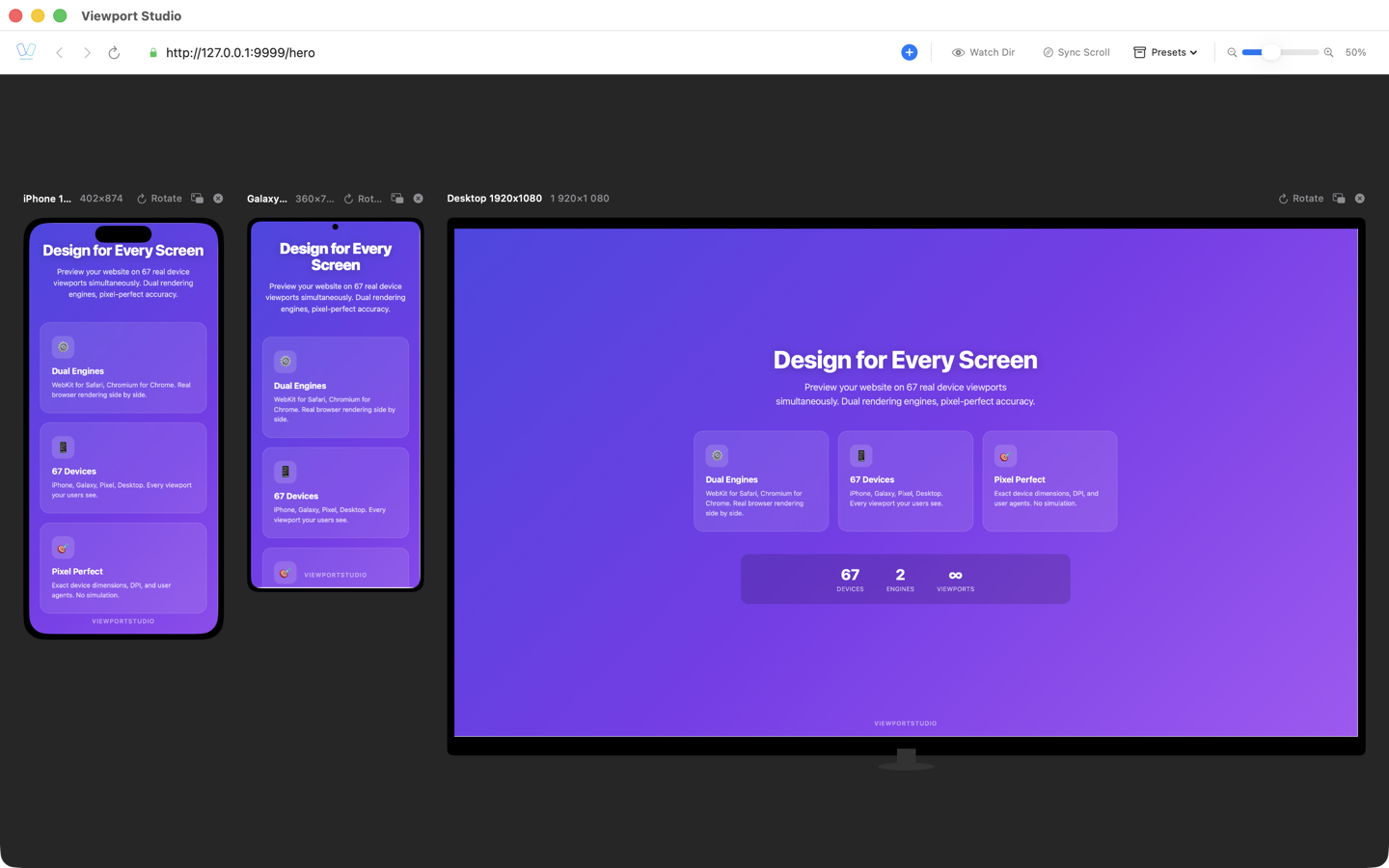
The BrowserView Approach: Real Engines and 60+ Device Profiles
BrowserView addresses a core device testing challenge for macOS developers—the ability to view your site through two real browser engines simultaneously, with accurate device profiles.
Two Real Rendering Engines
Unlike DevTools, which always render through a single engine, BrowserView runs:
- WebKit — the same engine used by Safari and all browsers on iOS
- Chromium — the same engine used by Chrome, Edge, and Android browsers
This means differences in CSS rendering, JavaScript execution, and font handling are visible immediately—side by side, in a single interface.
Device Profiles with Real Parameters
60+ built-in device profiles include:
- Accurate viewport in CSS pixels for each device
- Real DPR — not approximate, but the actual value used on the device
- Authentic user-agent — the server receives the same request as from a real device
- Touch emulation — for testing touch interactions
Profiles cover current devices: iPhone 15/14/13/SE, iPad Air/Pro, Samsung Galaxy S24/S23, Google Pixel 8/7, and more.
Workflow
A typical device testing workflow with BrowserView:
- Start your local server — enter your dev server URL
- Select devices — choose the profiles you need from the list
- Compare engines — switch between WebKit and Chromium or view both side by side
- Spot issues — rendering differences are visible instantly
- Fix and verify — code changes appear immediately after reload
The entire process runs locally, with no cloud latency and no need to switch between multiple applications.
Device Testing Checklist
Before Development
- Identify target devices based on your audience analytics
- Define critical breakpoints for your CSS media queries
- Choose an image strategy (srcset, picture, art direction)
- Decide whether you need a separate mobile version or a fully responsive design
During Development
- Test every component at the minimum (320px) and maximum viewport sizes
- Check both engines (WebKit and Chromium) for rendering differences
- Test both orientations (portrait and landscape) on tablet viewports
- Ensure touch targets are at least 44x44px
- Verify that hover states have fallbacks for touch devices
- Test with real content of varying lengths (short and long text)
- Check viewport units (
vh,dvh) on mobile device profiles
Before Release
- Run a complete pass through all critical user flows
- Check performance on budget device profiles
- Test with network throttling (3G, slow 4G)
- Verify safe area behavior on devices with notches
- Test on-screen keyboard behavior on mobile devices
- Validate image rendering at different DPR values (1x, 2x, 3x)
- Test navigation and forms on touch devices
- Check fonts and typography across platforms
After Release
- Set up error monitoring with breakdowns by device and browser
- Analyze analytics to find devices with high bounce rates
- Re-test after Safari and Chrome updates
- Review your target device list every 6 months
Conclusion
Testing your website on different devices isn't a one-time task—it's an ongoing process that should be built into your development workflow. The key to efficient device testing is finding the right combination of tools.
Use DevTools for quick checks while writing code. Add a local tool with real rendering engines (such as BrowserView) for daily responsive testing and catching cross-engine differences. Supplement with cloud services for comprehensive coverage and CI/CD integration. And don't skip real device testing before major releases.
The bottom line: test early and test often. The sooner you catch a rendering issue on a specific device, the cheaper it is to fix. With modern responsive design testing tools, checking your site across devices is fast enough to be part of your daily routine—not something you defer until the last minute.
Last updated: March 2026. Device testing tools and best practices evolve regularly. This guide reflects current recommendations for macOS web development.