Responsive Design Testing Tools: A Complete Guide for Modern Web Developers
Responsive web design is no longer optional—it's a fundamental requirement. With devices ranging from small smartphones to large desktop screens, developers must ensure their sites work flawlessly across all viewport sizes. Yet testing manually on actual devices isn't scalable, and quick browser resizing doesn't catch all the issues. That's where responsive design testing tools come in.
This guide explores the landscape of responsive testing solutions available for macOS developers, comparing their strengths, limitations, and real-world applications.
Why Responsive Testing Matters More Than Ever
Before diving into specific tools, let's establish why this problem exists. Modern web development involves:
- 60+ different device profiles with varying screen sizes, pixel densities, and aspect ratios
- Two major rendering engines: WebKit (Safari, iOS browsers) and Chromium (Chrome, Android browsers)
- Different CSS media query behavior between devices and orientations
- Performance variations that affect how designs render and load
A design that looks perfect on your 27-inch monitor might completely break on an iPhone SE. Typography might be unreadable, buttons might overlap, or touch targets might be too small. These issues can only be caught through proper testing—and that testing must use real browser engines, not just viewport resizing tricks.
Browser DevTools: The Built-In Foundation
Every modern browser includes responsive design mode, making it the obvious starting point for developers.
How It Works
Chrome DevTools and Safari Web Inspector let you simulate different devices and viewports directly in your development browser. You can toggle device orientation, throttle network speeds, and emulate touch interactions.
Strengths
- Free and always available in your primary development browser
- Fast iteration without context switching
- Access to full DevTools for debugging during responsive testing
- Network throttling and performance simulation
- Perfect for quick checks during development
Limitations
- Single viewport at a time means checking multiple devices sequentially
- Emulation only—simulating touch and performance is not the same as real behavior
- Inconsistent rendering between Chrome's emulation and actual Android devices
- No Safari on Android—you can't test how your site looks in Firefox, Opera, or other Android browsers
- Time-consuming workflow when testing against many breakpoints
Online Services: Accessibility Without Installation
Cloud-based testing platforms have proliferated, offering convenience for teams that want to avoid setup friction.
BrowserStack
BrowserStack provides real devices hosted in data centers. Developers can test on actual iPhones, Samsung phones, tablets, and more through a web interface.
Strengths:
- Real device testing eliminates emulation inconsistencies
- Access to older device versions that are hard to find
- Team collaboration with session sharing
- Automated screenshot testing across many devices
Limitations:
- Expensive at scale (pricing starts around $20/month for limited monthly minutes)
- Latency when interacting with remote devices—noticeably slower than local testing
- Limited to remote interaction—can't run local dev servers as easily
- Subscription-based, so costs accumulate
Responsively App & Similar Web-Based Tools
Responsively is a lightweight open-source tool that shows multiple device viewports simultaneously, with scroll synchronization and responsive design inspection.
Strengths:
- Shows 2-4 device viewports at once
- Free and open-source
- Good for quick responsive checks
- Lightweight and fast
Limitations:
- Uses Chromium only (no Safari/WebKit rendering)
- No real iOS testing capability
- Limited device database
- Runs in a browser, so performance testing is limited
Desktop Applications: The Serious Developer's Choice
For macOS developers doing serious responsive design work, dedicated desktop applications offer the best combination of speed, features, and accuracy.
Key Advantages of Desktop Apps
Real browser engines. The most important distinction: professional desktop testing apps use actual WebKit (Safari) and Chromium rendering engines. This means:
- CSS media queries behave exactly as they do in production
- JavaScript rendering matches real browsers
- Performance characteristics are representative
- Visual rendering (fonts, shadows, gradients) is pixel-perfect
- Touch events and mobile interactions work correctly
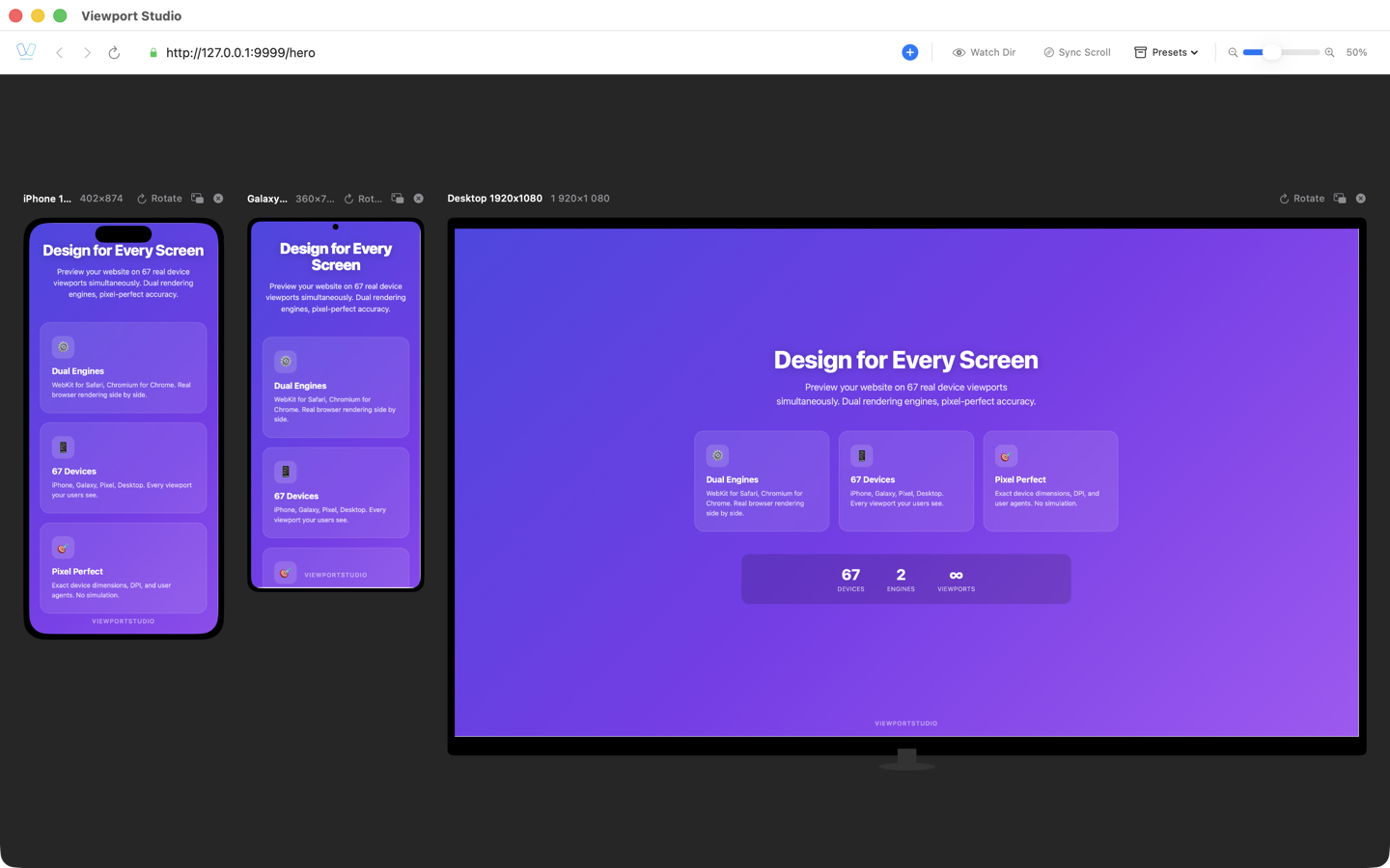
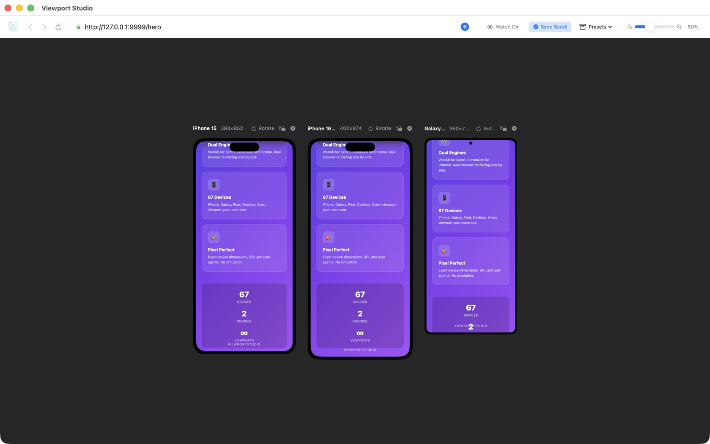
Multiple simultaneous viewports. Rather than switching between devices, you see 2, 3, or even 4+ devices rendering your site simultaneously. This allows you to:
- Spot inconsistencies immediately
- Test design harmonization across breakpoints
- Catch issues that only appear in specific device combinations
- Work more efficiently without constant tool switching
Local development integration. Desktop apps connect directly to your local dev server, meaning:
- Zero network latency
- Instant reload and DevTools inspection
- Full access to your development environment
- Works offline
BrowserView: Responsive Testing for the Modern Developer
BrowserView is a macOS desktop application specifically designed for responsive web design testing. It combines several professional-grade features:
Dual browser engine support:
- WebKit (Safari rendering) for testing iOS and macOS devices
- Chromium/CEF for Android and Chrome rendering
- This eliminates the need to choose between iOS and Android testing—you get both
60+ built-in device profiles covering:
- iPhone models (SE, 12, 13, 14, 15 series)
- iPad and iPad Pro variants
- Android phones and tablets (Samsung Galaxy, Google Pixel)
- Desktop breakpoints
Developer-friendly features:
- Synchronized scrolling across devices to test interactions
- Individual DevTools for each device viewport
- Auto-fit zoom layout that makes optimal use of screen space
- Detached windows for testing on secondary monitors
- One-click device rotation
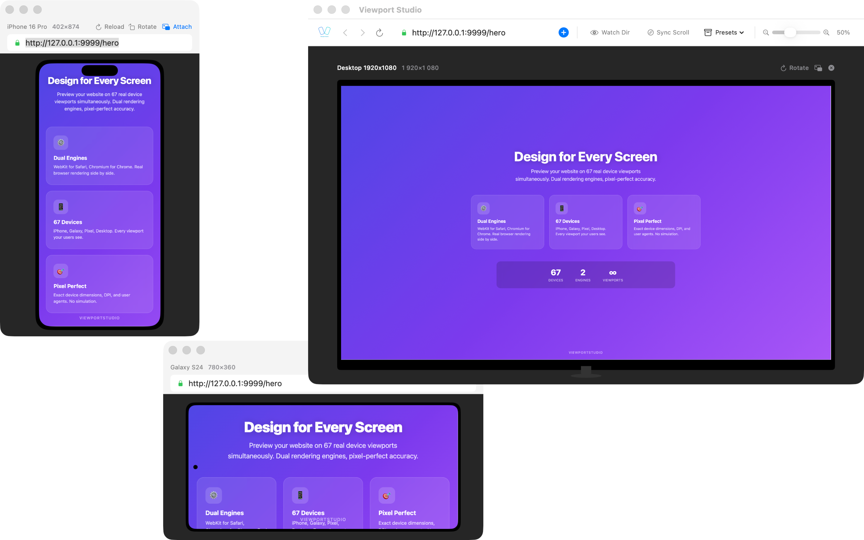
Why this matters for your workflow: Rather than running multiple browser windows with DevTools, resizing manually, and context-switching constantly, you can see iOS, Android, and desktop viewports all at once with full debugging capability.
Comparing the Approaches
| Feature | Browser DevTools | Online Services | Desktop Apps | BrowserView |
|---|---|---|---|---|
| Real browser engines | ✓ (Limited) | ✓ Real devices | ✓✓ | ✓✓ WebKit + Chromium |
| Multiple simultaneous viewports | ✗ | ✓ (Emulated) | ✓ | ✓ Up to 4+ |
| Local dev integration | ✓ | △ (Slower) | ✓ | ✓ |
| iOS testing | ✓ (Emulation) | ✓ Real | △ Safari emulation | ✓ WebKit |
| Android testing | ✓ (Emulation) | ✓ Real | ✗ Most lack this | ✓ Chromium |
| Cost | Free | $$$$ | $/Free | $ |
| Setup time | Zero | Minutes | Minutes | Minutes |
| Performance testing | △ Limited | ✓ | ✓ | ✓ |
| Team collaboration | △ Limited | ✓✓ | ✗ | ✗ Local only |
Recommended Testing Strategy
For most web development teams, a layered approach works best:
1. During Development: Browser DevTools
Use your browser's responsive mode for quick checks and iteration. It's fast and integrated with your dev environment.
2. For Comprehensive Testing: Desktop Application
When you need to validate across many devices—especially before merging to main branch or deploying—use a desktop app like BrowserView to test on both iOS and Android simultaneously.
3. For Final QA: Real Devices or BrowserStack
Before shipping to production, test on actual devices or use BrowserStack for remote device testing. This catches edge cases that emulation misses.
4. Ongoing Monitoring: Screenshot Services
For large sites with many pages, consider automated screenshot testing services to catch regressions.
Why Real Browser Engines Matter
This is crucial to understand: viewport resizing and browser emulation are not equivalent to responsive testing.
When you resize your browser window, you're changing the viewport size in a browser that was built for desktops. It doesn't account for:
- Touch event handling differs significantly from mouse events
- Viewport meta tags (viewport-fit, initial-scale) behave differently
- Safe area insets for notched devices
- Device pixel ratio (retina displays render text differently)
- Browser chrome (address bar, tabs) takes up space differently on mobile
- Font rendering varies between engines and platforms
WebKit (Safari) and Chromium render the same CSS differently in subtle but important ways. A gradient might look slightly different, text might break at different character positions, or flexbox might wrap differently.
Real browser engines catch these issues. Emulation and simple resizing miss them.
Implementation Tips for Responsive Testing
Structure Your Testing Process
- Mobile-first development — Build for the smallest viewport first
- Progressive enhancement — Test at each breakpoint as you add features
- Device classification — Test representative devices: small phone (iPhone SE), large phone (iPhone 14), tablet (iPad Pro), desktop
Use These Testing Checkpoints
- Typography legibility at each breakpoint
- Touch target sizes (minimum 44x44pt for iOS, 48dp for Android)
- Form input usability on small screens
- Navigation accessibility across breakpoints
- Image responsiveness and optimization
- Video/media player functionality
Create a Testing Baseline
Document your target devices and viewports:
- iOS: iPhone SE (375px), iPhone 14 (390px), iPad (768px)
- Android: Small phone (360px), Large phone (411px), Tablet (600px)
- Desktop: 1024px, 1440px, 1920px
Conclusion
Responsive design testing is not optional in modern web development. Choosing the right tools significantly impacts your productivity and code quality.
For macOS developers, the most efficient approach combines:
- Quick checks with browser DevTools during development
- Comprehensive validation with a desktop app supporting both WebKit and Chromium engines
- Final validation on real devices before production
BrowserView excels at the second point—providing simultaneous iOS and Android testing with real browser engines, eliminating the friction of managing multiple tools and windows.
The investment in proper responsive testing tools pays for itself through faster development cycles, fewer production issues, and more confident deployments across the entire device ecosystem.
Last updated: March 2026. Responsive design testing tools and capabilities evolve regularly. This guide reflects current best practices for macOS development.