Safari vs Chrome CSS Rendering Differences: A Developer's Guide
When you're building a modern web application, you quickly discover that "it works in Chrome" doesn't mean "it works everywhere." Safari and Chrome render CSS differently due to their underlying browser engines—WebKit (Safari) and Chromium (Chrome). Understanding these differences is crucial for cross-browser compatibility, especially when supporting both iOS and Android ecosystems.
In this guide, we'll explore the most common CSS rendering discrepancies between Safari and Chrome, provide real code examples, and show you how to test for these issues efficiently.
Why Do Safari and Chrome Render CSS Differently?
The short answer: different browser engines. Chrome uses Blink (based on Chromium), while Safari uses WebKit. Although both are open-source, they diverge significantly in:
- CSS spec implementation timelines
- Performance optimization priorities
- Bug fixes and proprietary features
- Layout calculation methods
This means a property that works perfectly in Chrome might behave unexpectedly in Safari, and vice versa. For developers targeting both macOS/iOS (Safari) and Android (Chrome), these differences create real challenges.
Common CSS Rendering Differences
1. Flexbox Gap Property
One of the most notorious differences: Safari's older versions don't support the gap property in flexbox containers.
Problem code:
.container {
  display: flex;
  gap: 1rem;  /* Chrome: works fine. Safari < 14.1: ignored */
}
Why it matters: Without gap support, you'd need margin workarounds that create inconsistent spacing.
Cross-browser fix:
.container {
  display: flex;
  gap: 1rem;  /* Modern browsers (Safari 14.1+, Chrome 84+) */
}

/* Fallback for older Safari */
.container > * + * {
  margin-left: 1rem;
}
Testing note: BrowserView lets you see this instantly—render the same CSS in Safari (WebKit) and Chrome (Chromium) side by side, immediately spotting the gap differences.
2. Backdrop Filter
Safari's backdrop-filter is more reliable than Chrome's, but they differ in performance and rendering edge cases.
Problem code:
.modal-overlay {
  backdrop-filter: blur(10px);
  background: rgba(0, 0, 0, 0.3);
}
Known issues:
- Chrome: backdrop-filter may cause repaints and performance issues with transformed elements
- Safari: generally stable, but can have artifacts with certain opacity values
- Firefox: still doesn't support it (requires
-webkit-prefix thinking)
Robust approach:
.modal-overlay {
  background: rgba(0, 0, 0, 0.3);
  backdrop-filter: blur(8px);
  /* Support both webkit and standard */
  -webkit-backdrop-filter: blur(8px);
  will-change: backdrop-filter;
}

/* Fallback for unsupported browsers */
@supports not (backdrop-filter: blur(1px)) {
  .modal-overlay {
    background: rgba(0, 0, 0, 0.5); /* Increase opacity as fallback */
  }
}
3. Scrolling Behavior
Safari and Chrome handle scroll behavior quite differently, especially with momentum scrolling and smooth scrolling.
Problem code:
html {
  scroll-behavior: smooth;
}
Differences:
- Chrome: smooth scrolling works reliably
- Safari: smooth scrolling behavior varies by platform (macOS vs iOS)
- iOS Safari: often ignores smooth scrolling due to native scrolling momentum
Better approach:
html {
  scroll-behavior: smooth;
}

/* Detect iOS and disable smooth scrolling for better UX */
@supports (-webkit-touch-callout: none) {
  html {
    scroll-behavior: auto;
  }
}
4. CSS Grid with Subgrid
Subgrid is a relatively new CSS Grid feature with inconsistent support:
Problem code:
.grid {
  display: grid;
  grid-template-columns: repeat(3, 1fr);
}

.subgrid {
  display: grid;
  grid-column: span 2;
  grid-template-columns: subgrid; /* Chrome 117+, Safari 16+ */
}
Support matrix:
- Safari 16+: Excellent subgrid support
- Chrome 117+: Recently added, still stabilizing
- Firefox 71+: Full support
Fallback strategy:
.subgrid {
  display: grid;
  grid-template-columns: repeat(2, 1fr);
  gap: inherit; /* Inherit gap from parent */
}

/* Enhanced version for browsers with subgrid */
@supports (grid-template-columns: subgrid) {
  .subgrid {
    grid-template-columns: subgrid;
  }
}
5. Font Rendering and font-smoothing
Safari and Chrome render fonts differently due to subpixel antialiasing.
Problem code:
body {
  font-family: -apple-system, BlinkMacSystemFont, 'Segoe UI', Roboto;
}
Issues:
- Safari: Uses subpixel antialiasing (appears sharper but can vary by background)
- Chrome: Uses grayscale antialiasing (more consistent, less sharp)
- Different rendering on Retina vs standard displays
Better approach:
body {
  font-family: -apple-system, BlinkMacSystemFont, 'Segoe UI', Roboto;
  -webkit-font-smoothing: antialiased;
  -moz-osx-font-smoothing: grayscale;
}

/* Adjust for dark mode */
@media (prefers-color-scheme: dark) {
  body {
    -webkit-font-smoothing: subpixel-antialiased;
  }
}
6. Aspect Ratio Behavior
While both support aspect-ratio, they handle edge cases differently.
Problem code:
.video-container {
  aspect-ratio: 16 / 9;
  width: 100%;
}
Differences:
- Safari: older versions don't support aspect-ratio at all
- Chrome: supports it with more lenient auto-sizing rules
- Height calculation differs when explicit height is also set
Defensive code:
.video-container {
  aspect-ratio: 16 / 9;
  width: 100%;
  max-width: 100%;
  height: auto;
}

/* Fallback for older browsers */
.video-container::before {
  content: '';
  float: left;
  padding-bottom: 56.25%; /* 16:9 ratio */
}

@supports (aspect-ratio: 1) {
  .video-container::before {
    display: none;
  }
}
7. CSS Position: Sticky
Sticky positioning has subtle implementation differences.
Problem code:
.header {
  position: sticky;
  top: 0;
}
Issues:
- Chrome: may not work inside overflow containers with certain combinations
- Safari: more robust but slower performance in some scenarios
- Both: fail differently when parent has
overflow: hidden
Correct implementation:
.header {
  position: sticky;
  top: 0;
  z-index: 10;
  will-change: transform;
}

/* Ensure parent supports overflow properly */
.container {
  overflow-y: auto;
  overflow-x: hidden;
}
How to Test CSS Rendering Differences
Manual Testing (The Old Way)
Testing cross-browser CSS differences the traditional way is tedious:
- Write code in Chrome
- Switch to Safari
- Check if it looks the same
- Iterate... repeat dozens of times
This workflow is slow and error-prone.
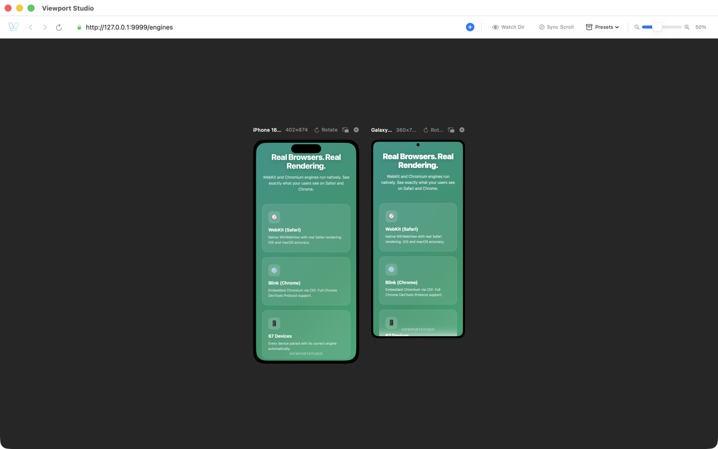
BrowserView: Real-Time Side-by-Side Testing
BrowserView is a macOS desktop application that solves this problem by rendering your website using two browser engines simultaneously:
- WebKit (left pane): Real Safari rendering for iOS/macOS compatibility
- Chromium (right pane): Chrome rendering for Android compatibility
Why this matters:
- See CSS rendering differences instantly—no browser switching
- Changes in your code update both engines in real-time
- Spot rendering discrepancies immediately
- Emulate iOS (Safari) and Android (Chrome) viewports simultaneously
Example workflow:
- Open your website in BrowserView
- Make a CSS change
- See both WebKit and Chromium rendering side by side
- Identify discrepancies immediately
- Fix and iterate
This eliminates the context-switching waste of traditional browser-swapping workflows.
Using Browser DevTools
Both Safari and Chrome have robust DevTools for CSS debugging:
Safari DevTools:
- Open with Cmd+Option+I
- Inspect element rendering engine specifics
- Check applied styles and computed values
Chrome DevTools:
- Open with Cmd+Option+J
- Use the console for cross-browser testing
- Check cascade and specificity issues
Browser Support and Fallbacks
Here's a quick reference for CSS feature support:
| Feature | Safari | Chrome | Status |
|---|---|---|---|
| Flexbox gap | 14.1+ | 84+ | Broadly supported |
| Backdrop-filter | 9+ | 76+ | With caveats |
| CSS Grid Subgrid | 16+ | 117+ | Newer feature |
| aspect-ratio | 15+ | 88+ | Well-supported |
| scroll-behavior | 15.4+ | 61+ | Smooth scrolling |
| CSS Custom Properties | 15.1+ | 49+ | Fully supported |
| Grid Template Areas | 10.1+ | 57+ | Fully supported |
Best Practices for Cross-Browser CSS
- Progressive Enhancement: Start with basic CSS, then layer in advanced features
- Feature Detection: Use
@supportsqueries instead of browser detection - Test Early: Don't wait until the end to test in multiple browsers
- Use Vendor Prefixes: Some properties still need
-webkit-in Safari - Check Computed Values: Use DevTools to verify what the browser actually applied
- Mobile First: Test on actual iOS and Android devices when possible
Conclusion
Safari vs Chrome CSS rendering differences are a reality of modern web development. While both engines are standards-compliant, their implementation details diverge enough to cause real compatibility issues.
The key strategies are:
- Understanding which properties differ between WebKit and Chromium
- Writing defensive CSS with fallbacks and
@supportsqueries - Testing early and often with both rendering engines
- Using tools like BrowserView to visualize differences in real-time
By following these practices and using the right tools, you can build CSS that works reliably across Safari and Chrome—ensuring your users have a consistent experience regardless of their browser or device.
Want to test your CSS across Safari and Chrome instantly? Try BrowserView, the macOS desktop app that renders your website with both WebKit and Chromium engines side by side. Stop switching browsers. Start seeing real-time rendering differences.