WebKit vs Chromium: What Every Web Developer Should Know
Two rendering engines — WebKit and Chromium (Blink) — shape how most users experience your website. Safari runs on WebKit, while Chrome, Edge, Opera, and Brave all run on Chromium. Together, they account for over 95% of the global browser market. Understanding the differences between these engines isn't academic trivia — it's a practical necessity for every web developer.
In this article, we'll take a detailed look at the architectural, CSS, JavaScript, and API differences between WebKit and Chromium, walk through real code examples, and explain how to effectively test cross-engine compatibility.
A Brief History: From Shared Roots to the Fork
Common Origins
Apple created WebKit in 2001, building on the KHTML engine from the KDE project. Google adopted WebKit for Chrome when it launched in 2008. For five years, both browsers shared a single rendering engine.
The 2013 Split: Blink Is Born
In April 2013, Google announced it was forking WebKit to create its own engine — Blink. The reasons behind the split:
- Architectural disagreements: Google wanted to implement a multi-process architecture that didn't fit WebKit's design
- Development velocity: A shared codebase slowed both teams down, since every change required coordination
- Diverging priorities: Apple focused on energy efficiency and deep macOS/iOS integration, while Google prioritized raw performance and advancing the web platform
Since the split, the two engines have diverged significantly. Blink became the foundation of the Chromium project, while WebKit remained under Apple's stewardship.
The Current Landscape
| Engine | Browsers | Platforms |
|---|---|---|
| WebKit | Safari, all iOS browsers* | macOS, iOS, iPadOS |
| Blink (Chromium) | Chrome, Edge, Opera, Brave, Vivaldi | Windows, macOS, Linux, Android |
*On iOS, all browsers — including Chrome and Firefox — are required to use WebKit due to Apple's App Store policy.
Architectural Differences Between the Engines
Process Model
Chromium uses an aggressive multi-process architecture:
- Each tab runs in its own isolated process
- A dedicated GPU process handles all graphics
- Separate processes for extensions, utilities, and networking
- Higher memory consumption, but better crash isolation
WebKit (in Safari) takes a more resource-efficient approach:
- Tab groups can share processes
- More efficient memory usage
- Tight integration with macOS/iOS system frameworks
- Power consumption optimized through native system APIs
The Rendering Pipeline
Both engines follow the same general pipeline: parse HTML, build the DOM, compute styles, layout, paint, and composite. But the implementation of each stage differs.
Chromium (Blink):
- Uses LayoutNG for layout calculations
- Custom compositing system (cc — Chromium Compositor)
- Skia for graphics rasterization
- Aggressive layer caching
WebKit:
- Core Layout for layout calculations
- Integration with Core Animation on macOS/iOS
- Core Graphics / Metal for rasterization
- Tight coupling with Apple's hardware acceleration
CSS Rendering Differences
1. backdrop-filter: Different Performance and Behavior
.glass-panel {
  background: rgba(255, 255, 255, 0.1);
  backdrop-filter: blur(20px);
  -webkit-backdrop-filter: blur(20px);
}
WebKit (Safari): backdrop-filter has been supported since Safari 9, and it performs well thanks to its integration with Core Image.
Chromium: Support arrived later (Chrome 76). It can cause performance issues when combined with transform or will-change on parent elements. Nested backdrop-filters may produce visual artifacts.
Robust solution:
.glass-panel {
  background: rgba(255, 255, 255, 0.15);
  -webkit-backdrop-filter: blur(20px);
  backdrop-filter: blur(20px);
}

/* Fallback when performance is critical */
@supports not (backdrop-filter: blur(1px)) {
  .glass-panel {
    background: rgba(255, 255, 255, 0.85);
  }
}
2. scroll-snap: Subtle Behavioral Differences
.carousel {
  scroll-snap-type: x mandatory;
  overflow-x: scroll;
}

.carousel-item {
  scroll-snap-align: start;
}
WebKit: Safari's momentum-based scrolling creates a smoother "snapping" feel. During a fast swipe, Safari may skip several items and land on a distant snap point.
Chromium: More predictable behavior — it snaps to the nearest point. The inertia animation feels less "physical."
Handling the differences:
.carousel {
  scroll-snap-type: x mandatory;
  overflow-x: scroll;
  -webkit-overflow-scrolling: touch; /* Smooth scrolling on iOS */
  scroll-behavior: smooth;
}

/* Limit scroll speed for predictable snapping */
.carousel-item {
  scroll-snap-align: center;
  scroll-snap-stop: always; /* Don't skip items */
}
3. Flexbox gap: A Legacy Compatibility Issue
.flex-container {
  display: flex;
  flex-wrap: wrap;
  gap: 16px; /* Safari < 14.1: ignored */
}
WebKit: Support for gap in flexbox only landed in Safari 14.1 (April 2021). Older iOS versions completely ignore this property.
Chromium: Has supported gap in flexbox since Chrome 84 (July 2020).
Cross-browser fallback:
.flex-container {
  display: flex;
  flex-wrap: wrap;
  gap: 16px;
}

/* Fallback for Safari < 14.1 */
@supports not (gap: 16px) {
  .flex-container > * {
    margin: 8px;
  }
  .flex-container {
    margin: -8px;
  }
}
4. Font Rendering: Visible Visual Differences
One of the most noticeable differences between the engines is how text is displayed.
body {
  font-family: -apple-system, BlinkMacSystemFont, 'Segoe UI', Roboto, sans-serif;
  -webkit-font-smoothing: antialiased;
  -moz-osx-font-smoothing: grayscale;
}
WebKit (Safari): Uses the native macOS/iOS font rendering system. Text appears slightly bolder and "softer." Subpixel antialiasing produces heavier-looking letterforms.
Chromium: Uses Skia for text rendering. Fonts appear thinner and crisper. Grayscale antialiasing is the default.
Normalizing text rendering:
/* Baseline normalization */
body {
  -webkit-font-smoothing: antialiased;
  text-rendering: optimizeLegibility;
}

/* On dark themes, fonts look thinner — compensate */
@media (prefers-color-scheme: dark) {
  body {
    -webkit-font-smoothing: auto;
    font-weight: 450; /* Semi-bold instead of 400 */
  }
}
5. Viewport Units on Mobile Devices
.hero {
  height: 100vh; /* Behaves differently across engines */
}
WebKit (iOS Safari): 100vh includes the area behind the address bar, causing content to be clipped when the navigation bar is visible.
Chromium (Android Chrome): 100vh can also mismatch the visible area due to the dynamic address bar.
Modern solution:
.hero {
  /* New viewport units solve this problem */
  height: 100dvh; /* Dynamic viewport height */

  /* Fallback */
  height: 100vh;
  height: -webkit-fill-available;
}
JavaScript Engine Differences: V8 vs JavaScriptCore
Compilation Architecture
V8 (Chromium):
- Ignition (bytecode interpreter) then TurboFan (optimizing JIT compiler)
- Aggressive speculative optimization
- Maglev — a mid-tier optimization level (since 2023)
- Excellent performance on long-running computations
JavaScriptCore (WebKit):
- LLInt (interpreter) then Baseline JIT, then DFG (Data Flow Graph), then FTL (Faster Than Light)
- Four-tier compilation (more tiers than V8)
- More conservative optimization, but faster startup
- Better energy efficiency on mobile devices
Real-World Performance
// Example: intensive computation
function fibonacci(n) {
  if (n <= 1) return n;
  return fibonacci(n - 1) + fibonacci(n - 2);
}

// V8 optimizes recursive calls faster
// JSC handles polymorphic calls better
console.time('fib');
fibonacci(40);
console.timeEnd('fib');
| Scenario | V8 (Chrome) | JSC (Safari) |
|---|---|---|
| Initial JS load time | Average | Fast |
| Long-running computations | Fast | Average |
| Memory consumption | High | Moderate |
| Power consumption | High | Low |
| RegExp performance | Fast | Average |
| Polymorphic code | Average | Fast |
ECMAScript Feature Support
Both engines aim for full spec compliance, but the timing of new feature availability differs:
// Example: Temporal API (Stage 3)
// Chrome (behind a flag): supported
// Safari: in development

// structuredClone — deep object cloning
const original = { nested: { value: 42 } };
const copy = structuredClone(original);
// Safari 15.4+, Chrome 98+

// Array.at() — negative indexing
const last = [1, 2, 3].at(-1); // 3
// Safari 15.4+, Chrome 92+
Web API Differences
Intersection Observer: Implementation Nuances
const observer = new IntersectionObserver((entries) => {
  entries.forEach(entry => {
    if (entry.isIntersecting) {
      entry.target.classList.add('visible');
    }
  });
}, {
  threshold: 0.5,
  rootMargin: '0px'
});
Key behavioral differences:
- WebKit: May fire callbacks with a delay during fast momentum scrolling
- Chromium: More predictable callback timing, but may miss elements during very fast scrolls
- rootMargin: WebKit is stricter about parsing units (requires
pxor%)
ResizeObserver: Different Notification Models
const observer = new ResizeObserver(entries => {
  for (const entry of entries) {
    // WebKit and Chromium may report different sizes
    const { width, height } = entry.contentRect;

    // borderBoxSize is the more reliable option
    if (entry.borderBoxSize) {
      const { inlineSize, blockSize } = entry.borderBoxSize[0];
      console.log(`Border box: ${inlineSize} x ${blockSize}`);
    }
  }
});
Difference: Chromium supported borderBoxSize and contentBoxSize earlier. WebKit added full support later, and older versions of Safari only expose contentRect.
Web Animations API
element.animate([
  { transform: 'translateX(0)', opacity: 1 },
  { transform: 'translateX(100px)', opacity: 0 }
], {
  duration: 300,
  easing: 'ease-out',
  fill: 'forwards'
});
WebKit: Tight integration with Core Animation delivers smooth animations on 120 Hz ProMotion displays. However, composite: 'add' and composite: 'accumulate' may not work correctly in older versions.
Chromium: More complete spec implementation, including commitStyles() and extended composite modes.
Media and Codec Support
| Format | WebKit (Safari) | Chromium (Chrome) |
|---|---|---|
| H.264 | Yes | Yes |
| H.265 (HEVC) | Yes | Partial (OS-dependent) |
| VP8 | No | Yes |
| VP9 | No | Yes |
| AV1 | Safari 17+ | Yes |
| WebM | Limited | Yes |
| AVIF (images) | Safari 16+ | Chrome 85+ |
| WebP | Safari 14+ | Chrome 32+ |
Practical Media Recommendations
<!-- Video with proper fallback -->
<video controls>
  <source src="video.webm" type="video/webm; codecs=vp9,opus">
  <source src="video.mp4" type="video/mp4; codecs=avc1.42E01E,mp4a.40.2">
</video>

<!-- Images with next-gen formats -->
<picture>
  <source srcset="image.avif" type="image/avif">
  <source srcset="image.webp" type="image/webp">
  <img src="image.jpg" alt="Description">
</picture>
Developer Tools: Safari Web Inspector vs Chrome DevTools
Chrome DevTools
Chrome DevTools is the industry standard, offering an extensive feature set:
- Performance: Detailed analysis with flame charts and frame-by-frame recording
- Lighthouse: Built-in performance and accessibility audits
- Network: Throttling and detailed waterfall analysis
- Application: Service Workers, Storage, Cache API
- Layers: Compositing layer visualization
- Coverage: Unused CSS and JS analysis
Safari Web Inspector
Safari Web Inspector is less well-known but offers unique capabilities:
- Timelines: Energy consumption and CPU load per tab
- Canvas: WebGL and Canvas 2D inspector
- Network: Real iOS device requests via USB
- Elements: CSS Grid and Flexbox overlay visualization
- Audit: Accessibility checks based on Apple's standards
What to Use for Cross-Engine Debugging
Effective debugging requires both toolsets. A typical workflow:
- Spot a visual discrepancy between engines
- Open Safari Web Inspector to analyze WebKit's computed styles
- Open Chrome DevTools to compare Chromium's values
- Identify the point of divergence in the DOM/CSSOM
How to Test Cross-Engine Differences
The Problem with the Traditional Approach
The typical cross-engine testing process looks like this:
- Open Chrome, check the layout
- Open Safari, check the same layout
- Switch between windows, trying to spot differences
- Repeat for every device and breakpoint
This process is slow, error-prone, and exhausting. Visual differences between engines are easy to miss when you're switching between windows.
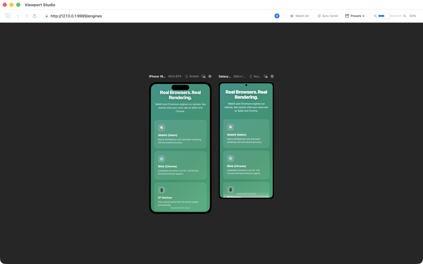
BrowserView: Real Engines Side by Side
BrowserView is a macOS app that solves this problem at its core. It renders your site simultaneously in two real browser engines:
- WebKit — the same engine that powers Safari and all iOS browsers
- Chromium — the same engine behind Chrome, Edge, and Android browsers
The key advantage: you see both renderings side by side in a single interface. Differences in CSS, fonts, animations, and layout are visible instantly — no browser switching required.
With 60+ device profiles (iPhone, iPad, Pixel, Galaxy), BrowserView shows how your site looks at real viewport sizes with accurate device pixel ratios and user agent strings. This isn't DevTools emulation that simply resizes a window — it's rendering with real engines.
Workflow:
- Enter your site URL or local dev server address
- Select the devices you want to test
- See WebKit and Chromium side by side instantly
- Edit your CSS — both engines update in real time
- Spot differences immediately and fix them on the spot
Automated Testing
For CI/CD pipelines, automated visual testing tools are invaluable:
// Example: Playwright for cross-engine testing
const { chromium, webkit } = require('playwright');

async function crossEngineTest(url) {
  const browsers = [
    { name: 'Chromium', engine: chromium },
    { name: 'WebKit', engine: webkit }
  ];

  for (const { name, engine } of browsers) {
    const browser = await engine.launch();
    const page = await browser.newPage();
    await page.goto(url);
    await page.screenshot({ path: `screenshot-${name}.png` });
    await browser.close();
  }
}
Best Practices for Cross-Engine Compatibility
1. Use Feature Detection, Not Browser Detection
// Bad: browser detection
if (navigator.userAgent.includes('Safari')) {
  // Safari-specific code
}

// Good: feature detection
if (CSS.supports('backdrop-filter', 'blur(1px)')) {
  // Use backdrop-filter
}
/* CSS feature detection */
@supports (scroll-snap-type: x mandatory) {
  .carousel {
    scroll-snap-type: x mandatory;
  }
}
2. Test in Both Engines from Day One
Don't leave cross-engine testing until the end of a project. The earlier you catch a discrepancy, the cheaper it is to fix.
3. Stay on Top of Compatibility Tables
Before using a new CSS feature or Web API, check browser support:
- Can I Use (caniuse.com) — for CSS and HTML
- MDN Web Docs — for JavaScript APIs
- WebKit Blog and Chrome Status — for upcoming features
4. Write Progressive CSS
/* Base style — works everywhere */
.card {
  padding: 16px;
  border-radius: 8px;
  background: white;
}

/* Enhancement for supporting browsers */
@supports (backdrop-filter: blur(10px)) {
  .card {
    background: rgba(255, 255, 255, 0.7);
    backdrop-filter: blur(10px);
    -webkit-backdrop-filter: blur(10px);
  }
}
5. Don't Forget -webkit- Prefixes
Some properties still require vendor prefixes for full compatibility:
.element {
  -webkit-backdrop-filter: blur(10px);
  backdrop-filter: blur(10px);

  -webkit-text-size-adjust: 100%;
  text-size-adjust: 100%;

  -webkit-tap-highlight-color: transparent;
}
6. Account for Performance Differences
// Debounce Intersection Observer on Safari
// due to delayed callbacks during momentum scrolling
function createObserver(callback, options) {
  let timeout;
  return new IntersectionObserver((entries) => {
    clearTimeout(timeout);
    timeout = setTimeout(() => callback(entries), 50);
  }, options);
}
7. Handle Media Formats Correctly
Always provide fallbacks for video and images, accounting for different codec support across engines.
8. Automate Cross-Engine Tests
Include visual regression testing in your CI/CD pipeline for both engines. Playwright supports running tests in WebKit and Chromium from a single script.
Conclusion
The differences between WebKit and Chromium are a fact of life in modern web development. While both engines follow the same standards, their implementations diverge in CSS rendering details, JavaScript performance, media format support, and Web API behavior.
Key takeaways:
- Know the differences: backdrop-filter, scroll-snap, viewport units, and font rendering are specific areas where the engines behave differently
- Use feature detection:
@supportsandCSS.supports()instead of browser sniffing - Test in both engines: BrowserView lets you view WebKit and Chromium side by side at real device sizes, making it easy to spot discrepancies instantly
- Write progressively: Base styles for all engines, enhancements for those that support them
Investing time in understanding cross-engine differences pays off with a consistent user experience — whether someone opens your site in Safari on an iPhone or Chrome on Android.